
Fitxer:2017- Donald Trump veracity - composite graph.png

Fitxer original (2.775 × 1.750 píxels, mida del fitxer: 141 Ko, tipus MIME: image/png)
| Aquest fitxer i la informació mostrada a continuació provenen del dipòsit multimèdia lliure Wikimedia Commons. |

|
Aquesta imatge (de tipus gràfic) s'hauria de tornar a crear utilitzant gràfics vectorials com ara un fitxer SVG. Això té diversos avantatges; en trobareu més informació a Commons:Media for cleanup. Si ja disposeu d'una versió d'aquesta imatge en format SVG, us preguem que la pengeu; després, reemplaceu aquesta plantilla amb la plantilla {{Vector version available|nom nou de la imatge.svg}} en aquesta imatge.
|
Resum
| Descripció |
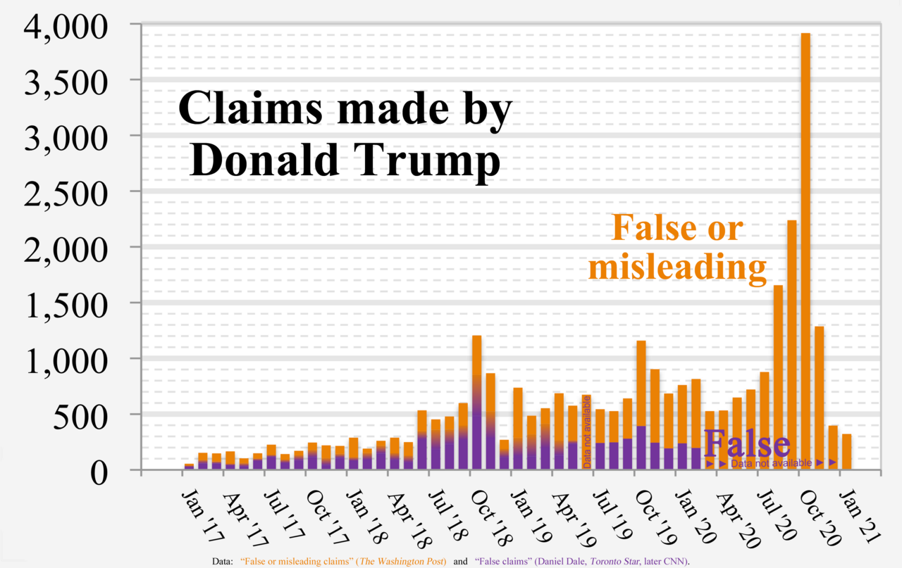
English: Chart of Donald Trump's “False or misleading claims” (The Washington Post) and “False claims” by Daniel Dale (Toronto Star, later CNN)
Technical details:
|
| Data | |
| Font | Treball propi |
| Autor | RCraig09 |
| Altres versions |
 |
Source data
- Data used to form fact check from The Washington Post is in image description page for File:2017- Donald Trump - graph - false or misleading claims.png
- Data used to form Toronto Star / CNN graph is in collapsible text:
- Versions 1 through 4:
| Click at right to show/hide data for Toronto Star / CNN portions (center of "error bars" in Versions 1-4) |
|---|
|
Month False statements |
- Version 5+:
| Click at right to show/hide data for Toronto Star / CNN portions (below, inside, and above Gradient regions in Version 5) |
|---|
|
Each three of the following data items are "stacked" (violet, below gradient, below orange) to form a full-height column. Month MIN GRADIENT WashPost |
Llicència
- Sou lliure de:
- compartir – copiar, distribuir i comunicar públicament l'obra
- adaptar – fer-ne obres derivades
- Amb les condicions següents:
- reconeixement – Heu de donar la informació adequada sobre l'autor, proporcionar un enllaç a la llicència i indicar si s'han realitzat canvis. Podeu fer-ho amb qualsevol mitjà raonable, però de cap manera no suggereixi que l'autor us dóna suport o aprova l'ús que en feu.
- compartir igual – Si modifiqueu, transformeu, o generareu amb el material, haureu de distribuir les vostres contribucions sota una llicència similar o una de compatible com l'original
Historial del fitxer
Cliqueu una data/hora per veure el fitxer tal com era aleshores.
| Data/hora | Miniatura | Dimensions | Usuari/a | Comentari | |
|---|---|---|---|---|---|
| actual | 08:23, 9 feb 2021 | | 2.775 × 1.750 (141 Ko) | RCraig09 | Version 16: Eliminate Oct 2016 as irrelevant date to include. Reduced filesize at tinypng.com |
| 08:08, 9 feb 2021 |  | 2.775 × 1.750 (140 Ko) | RCraig09 | Version 15: Update to include final data for January 2021. Reduced filesize at tinypng.com. | |
| 09:00, 16 gen 2021 |  | 2.775 × 1.750 (520 Ko) | RCraig09 | Version 14: Update to include Washington Post data for Nov and Dec 2020 | |
| 01:32, 6 gen 2021 |  | 2.775 × 1.750 (588 Ko) | RCraig09 | Version 13: Updated to include Washington Post data through October 2020. | |
| 01:39, 21 des 2020 |  | 2.775 × 1.750 (495 Ko) | RCraig09 | Version 12: Update to include Washington Post data through end of September 2020. | |
| 09:24, 16 nov 2020 |  | 2.775 × 1.750 (532 Ko) | RCraig09 | Version 11: Updating graph to include exact value for August 2020 that no longer involves extrapolation for the last four days of the month. Washington Post added a few more days to their database. | |
| 00:28, 22 oct 2020 |  | 2.775 × 1.750 (532 Ko) | RCraig09 | Version 10: Update to include Washington Post data for July and August 2020. Had to expand vertical scale to accommodate new high in data value (for August 2020). | |
| 08:43, 13 jul 2020 |  | 2.775 × 1.750 (522 Ko) | RCraig09 | Version 9: updated to include Washington Post data for June 2020. | |
| 08:00, 5 juny 2020 |  | 2.775 × 1.750 (515 Ko) | RCraig09 | Version 8: Updating to include Washington Post data for April and May 2020 | |
| 22:29, 15 abr 2020 |  | 2.775 × 1.750 (586 Ko) | RCraig09 | Version 7: updated to include CNN data for Jan and Feb 2020 |
Ús del fitxer
La pàgina següent utilitza aquest fitxer:
Ús global del fitxer
Utilització d'aquest fitxer en altres wikis:
- Utilització a en.wikipedia.org
- Utilització a he.wikipedia.org
- Utilització a hy.wikipedia.org
- Utilització a ja.wikipedia.org
- Utilització a pfl.wikipedia.org